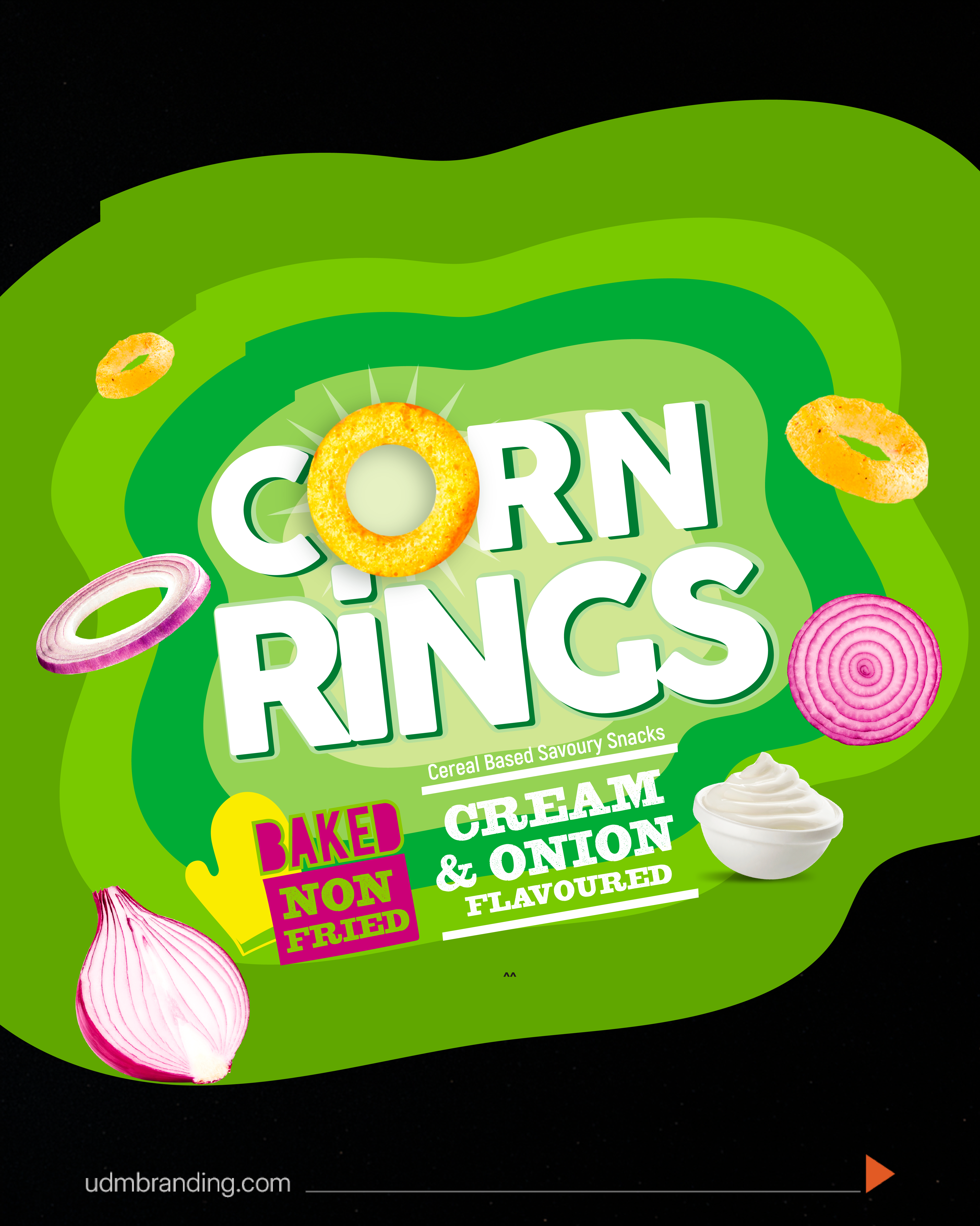
Immediate category cues.
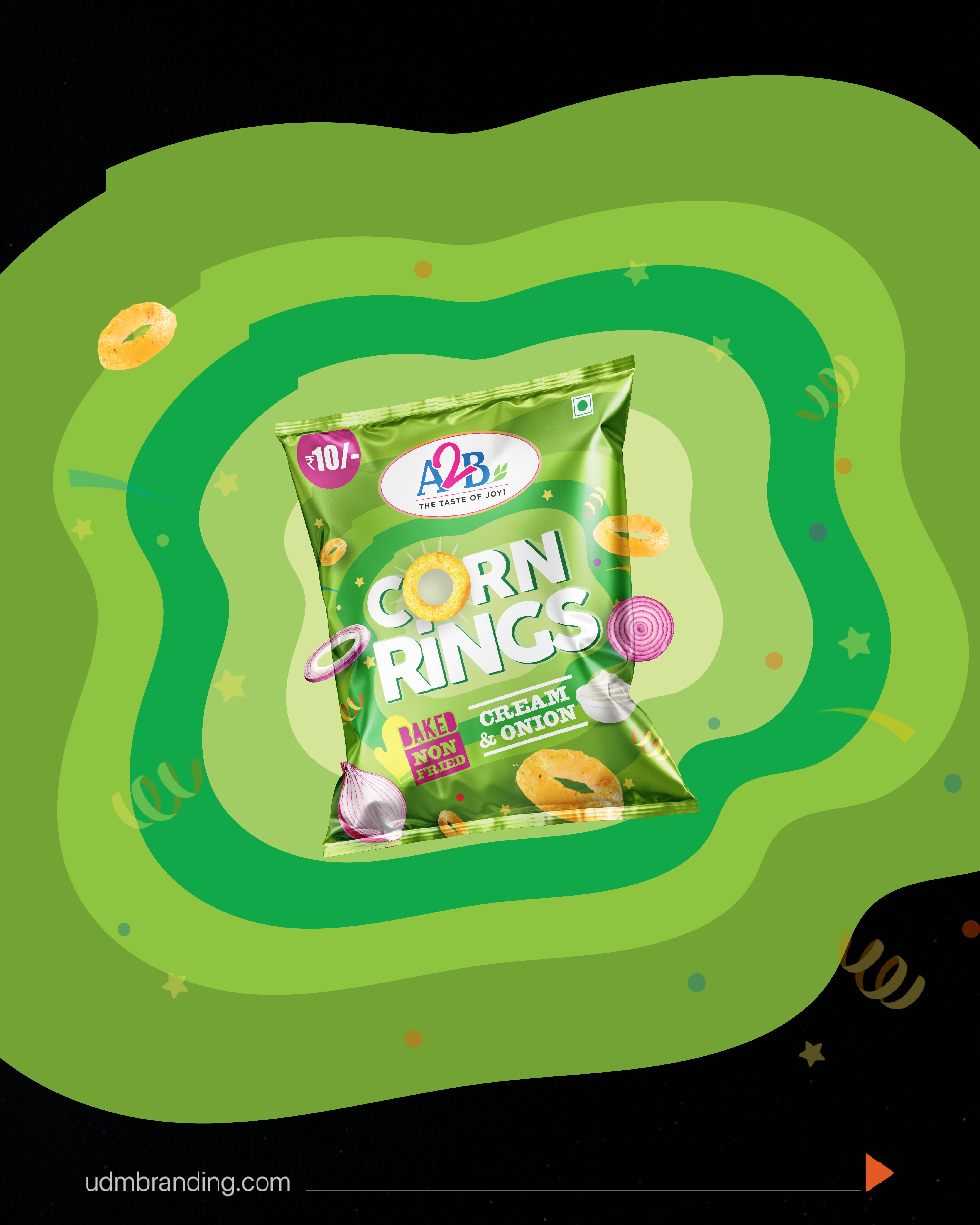
Bold snack shapes and flavour ingredients explain the product at a glance.
 START A CONVERSATION
A2B Snackonauts · Packaging Strategy
A2B was known for authentic Indian products, heritage, trust and familiarity.
Entering the corn-snack segment created a perception risk. Consumers were not asking whether the product was good. They were asking whether A2B belonged in this unfamiliar category at all.
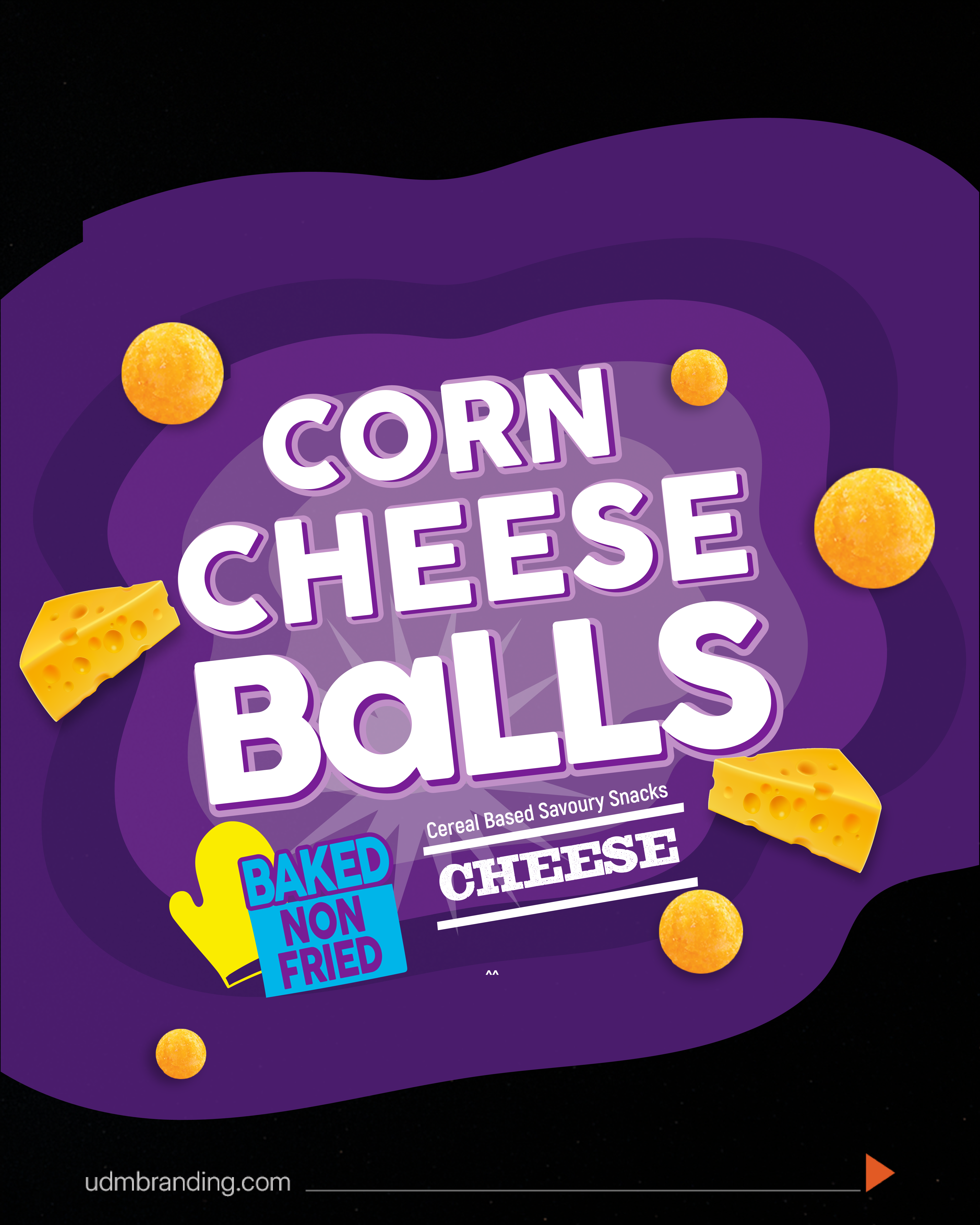
We designed permission to try.
A regional brand does not need a national advertising budget to earn shelf space. It needs packaging that makes retailers and consumers believe in the brand before the first bite.
The system made the range feel different and legitimate at the same time—giving a familiar brand a credible way into an unfamiliar aisle.
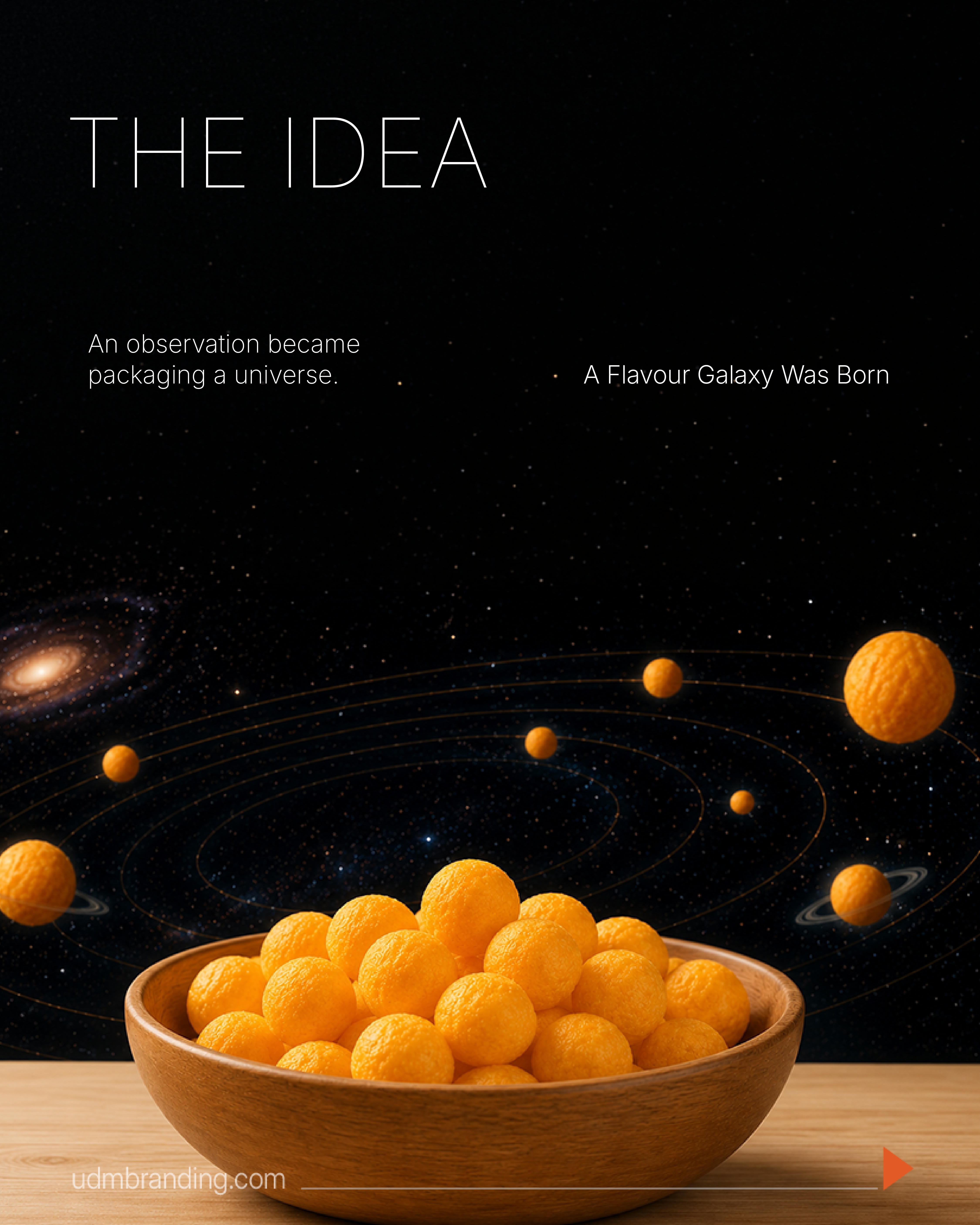
Corn balls became planets. Corn rings became orbits.
Playfulness met structure across flavour, typography, pack colour and product imagery. The idea created one recognisable universe with enough flexibility for every product to feel like its own destination.
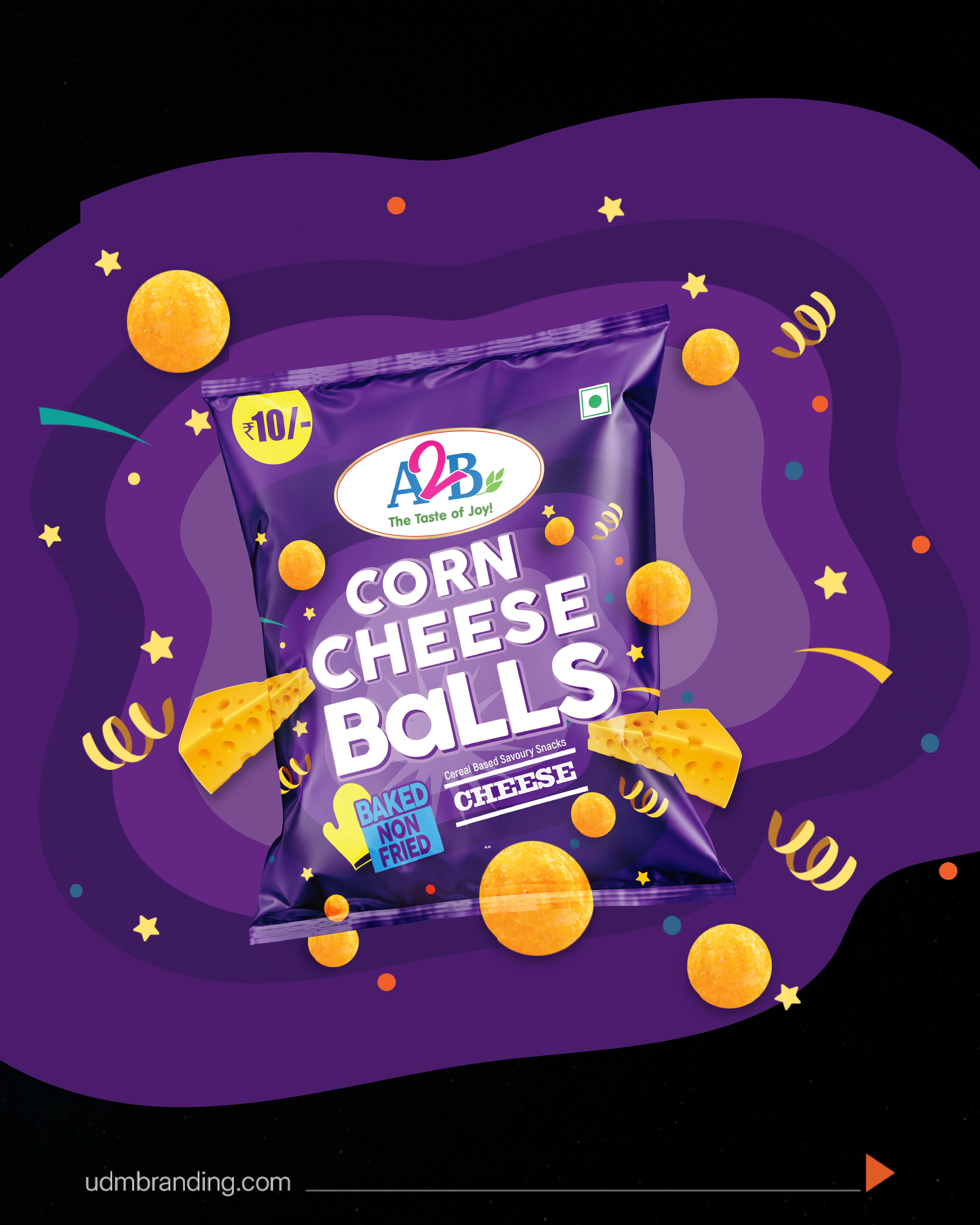

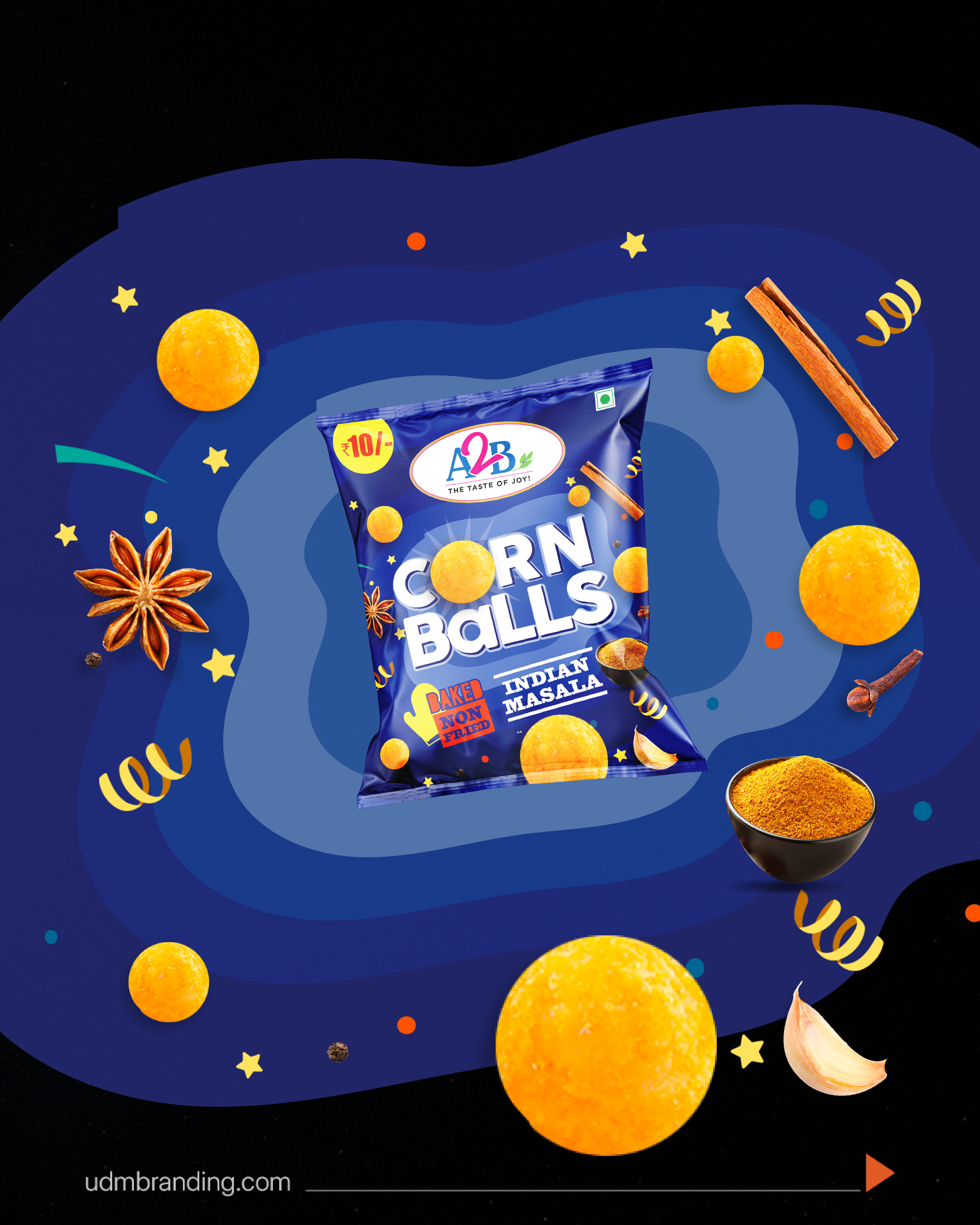
The packaging system
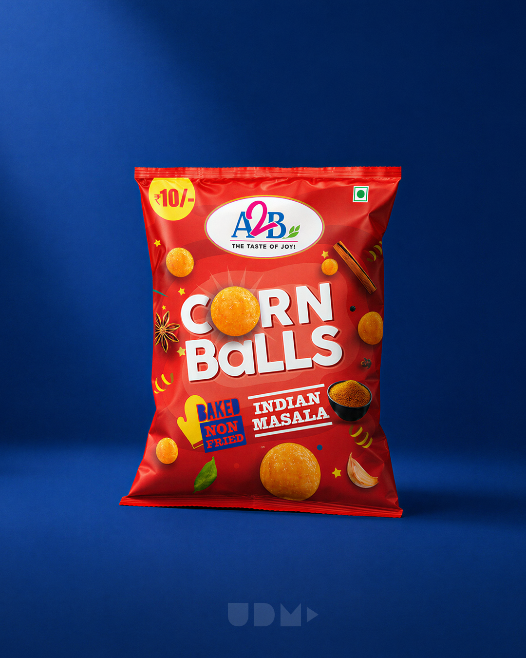
Bold snack shapes and flavour ingredients explain the product at a glance.
Planetary forms, vivid palettes and dimensional type hold the range together.
The A2B masterbrand remains clear while the new category earns a playful identity of its own.
04 · In motion
Motion extends the Flavour Galaxy from pack to screen while keeping the product, flavour and A2B trust mark at the centre.
05 · The outcome
Packaging reshaped how retailers and shoppers perceived A2B's fit in the corn-snack category, shifting trial from scepticism toward belief.