START A CONVERSATION

Work / Transformations

This is not a portfolio,
It’s a proof.

Every brand here had a good product.
Every brand here was stuck.

What changed wasn’t the logo,
It was the reason consumers chose them.

That’s Brand Reforge,
And these are the numbers it produces.

Transformations

Different categories. Different markets.
Same diagnosis every time.

AachiView project ↗

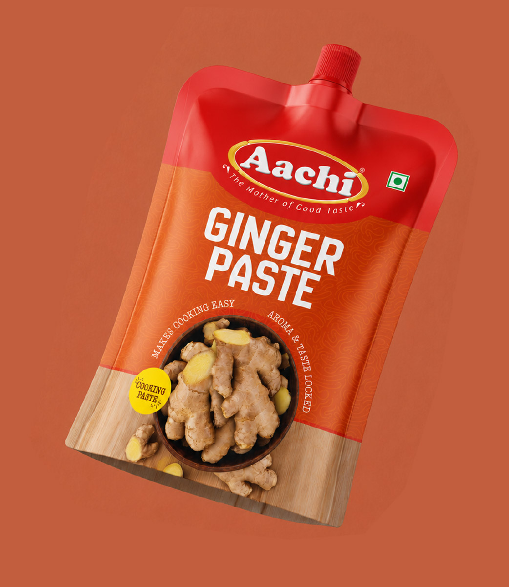
Aachi

Masala & Spices · Pan-India · 14+ Year Reforge Relationship

400 products. 14+ years. One question, every time.

Read the transformation

The relationship

Aachi Masala did not come to UDM for a rebrand.
They came because they had a product expanding faster than their brand could carry it.

New SKUs. New categories. New markets.
Every launch needed the brand to work harder than the last.

What 14+ years looks like

14+ years is not a contract. It is a result.

Every product UDM touched was built around one principle: the consumer reaches for this before reading the label — or the packaging has failed.

400+ products across Aachi’s range. Each one designed to earn the reach. Not demand it.

Multiple SKUs saw measurably stronger shelf performance post-reforge. Not because the product changed. Because the brand finally looked like what the product deserved.

The principle

When a brand stays with the same studio for 14+ years, it isn’t loyalty. It’s the simplest measure of results there is.

14+ Years · 400+ Products · Pan-India

Read the full story
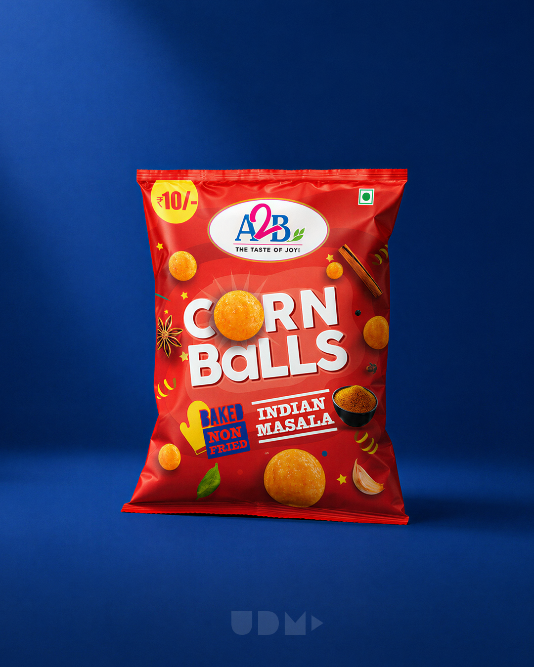
A2B Snackonauts corn snack packagingView project ↗

A2B Snackonauts

FMCG · South India · Category Launch

Familiar trust. A whole new flavour of possibility.

A2B's corn-snack launch needed to make a trusted food brand feel at home in a new aisle. A playful Flavour Galaxy connected familiar brand assurance with the excitement of discovery.

Read the transformation

The challenge

A2B had heritage and product credibility. Its new corn-snack range needed shoppers and retailers to believe the brand belonged in this category too.

The idea

Snack shapes became the starting point for a Flavour Galaxy: corn balls as planets and rings as orbits. Bold typography, flavour colours and clear product cues gave each pack its own character within a recognisable family.

The outcome

The supplied project account reports South India placement dominance within 90 days, retailer confidence in the new category and IRCTC premium food-service validation.

Project scope

Packaging strategy · Range identity · Flavour architecture · Product communication

Read the full story ↗
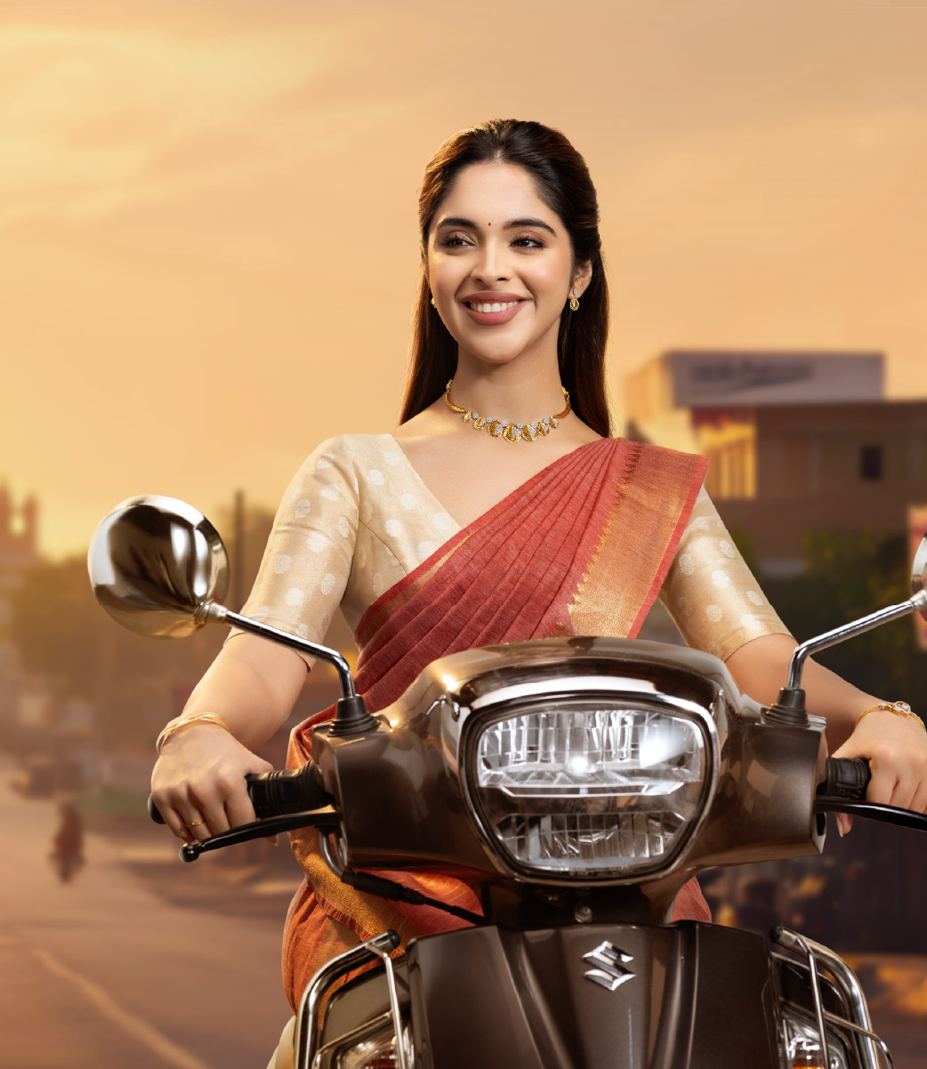
Vishnu Priya Jewellery campaignView project ↗

Vishnu Priya Jewellery

Jewellery · Retail · Brand Reforge

Trusted for years. Chosen for life's bigger moments.

Vishnu Priya's loyal customers knew its quality. The opportunity was to carry that trust into weddings, premium purchases and contemporary collections through a clearer brand position.

Read the transformation

The challenge

Strong repeat business did not always translate into consideration for larger purchases. Customers who trusted Vishnu Priya still looked at bigger jewellery brands for important occasions.

The strategic shift

Accessible luxury brought together the brand's service, lightweight designs and community relationships. A contemporary identity, retail experience and culturally relevant campaigns made that position visible.

The transformation

The case study describes a broader customer mix, stronger consideration for wedding jewellery and a move from local recognition toward market pull.

Project scope

Positioning · Visual identity · Retail experience · Campaigns · Digital communication

Read the full story ↗
Tamil PaalView project ↗

Tamil Paal

Dairy · Tamil Nadu · Cultural Identity to Market Pull

50 years of honest milk. No one could see it.

Read the transformation

Before the reforge

Tamil Paal had spent 50 years building trust the hard way.
Farmer relationships, Preservative-free commitment, and Quality without shortcuts.

But in modern retail — dominated by large corporate dairy brands — none of the truth was visible on the shelf.

The packaging looked generic. Retailers hesitated to give shelf space. Customers walked past.

50 years of honest farming.
Invisible at the point of purchase.

What was actually wrong

The product wasn’t the problem.
The truth wasn’t the problem.

The problem was that no one had ever given that truth a face.

Tamil Paal sourced from the Delta Region — Tamil Nadu’s most fertile agricultural belt. 50 years of that origin. That soil. That commitment.

And not one dairy brand in the category had ever claimed that territory.

That was the diagnosis. Not a visibility problem. An unclaimed truth problem.

What changed

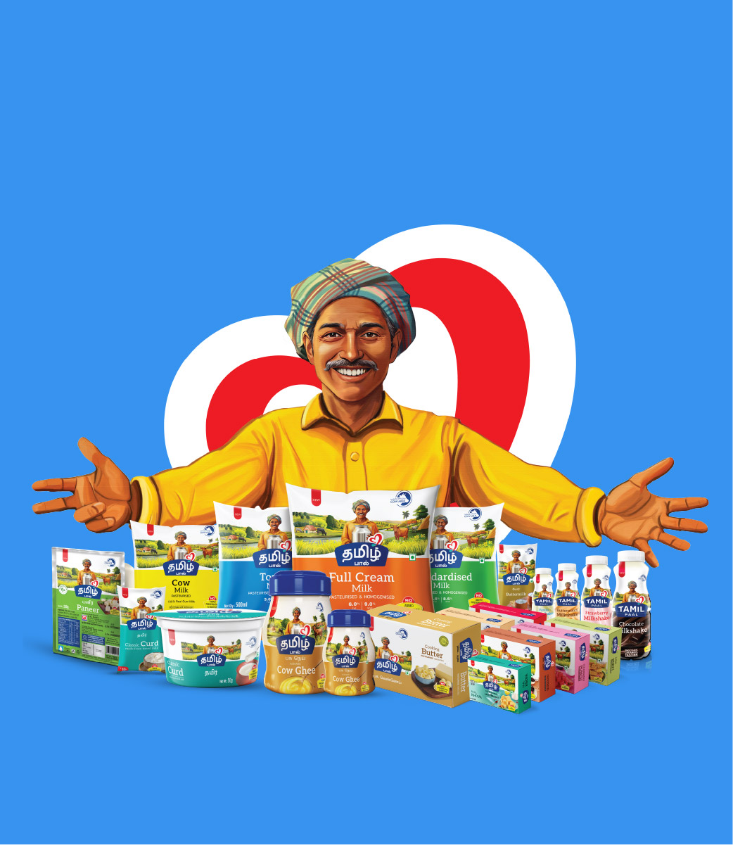
UDM did not design a mascot. They chose a cultural archetype.

Annamalai — named with deliberate Tamil intent. In Tamil cinema, Annamalai is the honest hero who rises through character, not cunning. Innocent. Resilient. Never compromising.

Tamil Paal’s story is similar, and Tamil people recognised it immediately.

The new identity built everything around that recognition: Tamil-first typography, warm agricultural colour architecture, Delta Region illustration, a clear No Preservatives promise.

15 SKUs — milk, curd, ghee, butter, paneer, milkshake, sweets — unified under one coherent visual language. One cultural truth. One brand world.

The brand extended consistently beyond packaging: vehicle branding, refrigerator branding, retail hoarding, franchise materials. Everywhere Tamil Paal appeared, it looked like the same honest thing.

The numbers

Value-added product growth
13.75% CAGR
Retail shelf visibility
2× increase
Customer repeat purchase rate
8 out of 10
Retailer confidence score
9 out of 10
Packaging recall & differentiation
10 out of 10

The signal that mattered most

Tamil Paal’s own employees began recruiting friends and family into the company.

Not because salaries changed, because they were proud of where they worked.

When a Brand Reforge changes how people feel about being part of it — that’s Pull reaching all the way inside the organisation.

Brand voice line

“Earlier, we sold Tamil Paal. Now Tamil Paal sells on its own.”

The principle

Tamil Paal didn’t grow by becoming less local.
It grew by making local something worth being proud of again.

Read the full story
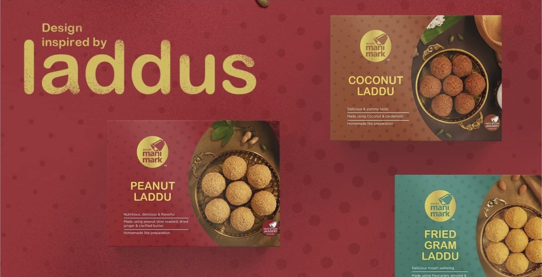
Arcot ManiMark identity and packaging systemView project ↗

Arcot ManiMark

Traditional Snacks · Tamil Nadu · Brand Reforge

From commodity to brand. From invisible to believed.

Exceptional product quality was trapped behind commodity-grade perception. The Reforge rebuilt retailer belief, shelf trust and ManiMark’s ability to grow under its own name.

Read the transformation

The diagnosis

The founder described a sales challenge. UDM found a belief goal: retailers rejected the product before tasting it because its presentation communicated commodity.

The Reforge

UDM rebuilt the positioning, identity, packaging, merchandising and digital presence while making retailers and distributors the first audience to convince.

The result

Revenue grew from ₹17 crores to ₹76 crores in four years, five owned stores became more than sixty in five years, and export markets opened.

Read the full story
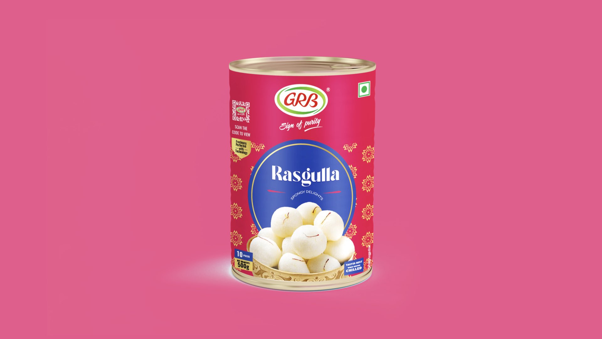
GRB Rasgulla redesigned packaging

GRB

Indian Sweets · Packaging · Pack Redesign

A familiar product, presented with greater appetite and confidence.

GRB Rasagulla’s packaging was refreshed with stronger product imagery, clearer hierarchy and a more distinctive colour system designed to improve recognition on shelf.

Different categories.
Different markets.
Same diagnosis every time.

Good product.
Brand that had not earned the right to be chosen.

The product was never the problem.
The brand was doing the work of a stockist, not a choice-maker.

Every transformation on this page began with that diagnosis.
Every result followed from fixing it.

That’s the Brand Reforge Method.

See how it works

Your brand could be the next transformation on this page.

Tell us where it’s stuck.
We’ll tell you what the reforge looks like.

Let’s talk