
Selected Work · Tamil Paal
Brand Reforge · Dairy · Tamil Nadu
50 years of honesty, Hidden on the shelf. Until the brand caught up.
Tamil Paal had already earned trust through its product. Our job was to make that truth visible, distinctive and impossible to walk past.
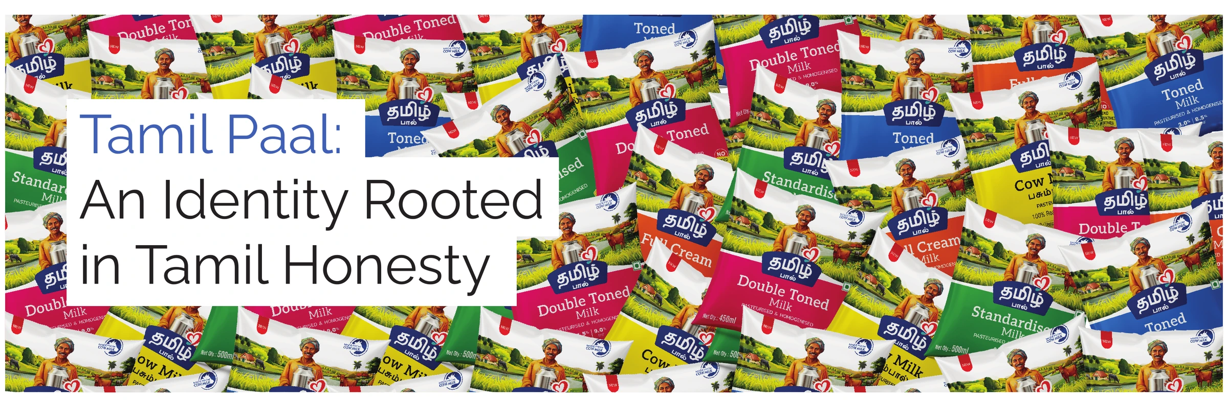 Scroll through the reforge ↓
01 · The business problem
A trusted product was being read as an ordinary brand.
Tamil Paal had spent five decades building trust through quality, farmer relationships and a preservative-free commitment. But in modern retail, none of that brand truth was visible.
The packaging looked generic, retailers hesitated to give it shelf space and customers walked past. The product was not underperforming. The brand was under-expressing the product.
The friction was simple:
50 years of honesty disappeared at the point of purchase.
01Strategic
truth
truth
The Delta Region was not scenery. It became the position.
Tamil Nadu’s fertile Delta belt had not been claimed by a dairy brand as a meaningful positioning platform.
Tamil Paal sourced from there. We turned that operational truth into the brand’s most credible and ownable difference: local goodness, visibly rooted in place.
02 · The identity challenge
Contemporary, Familiar, and Unmistakable Tamil.
Tamil Paal needed more than a modern logo. It needed an identity capable of changing perception without imitating national dairy brands or losing the emotional familiarity of Tamil culture.
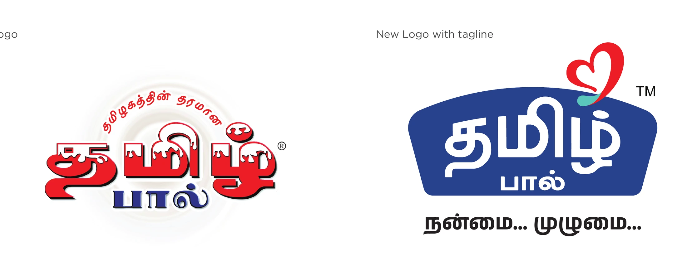
The old identity carried heritage, but it lacked a system strong enough for today’s retail environment.
The new identity created stronger visibility, faster recognition and a clearer emotional signal: this is a Tamil brand that understands where it comes from.
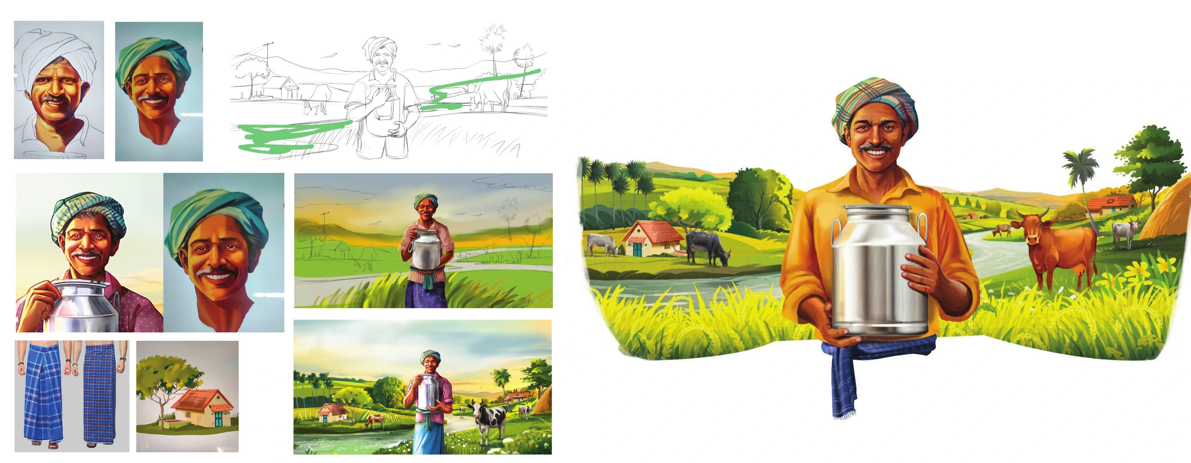
We didn’t design a mascot. We chose a cultural archetype.
03 · The character system
Annamalai gave honesty a face.
In Tamil cinema, Annamalai is the honest hero who rises through character rather than cunning: innocent, resilient and never compromising.
That mirrored Tamil Paal’s own story: decades of honest farming, quality without shortcuts and pride without pretence. The character was designed to feel like someone people already knew and trusted.
04 · The identity language
One system. Every element connected.
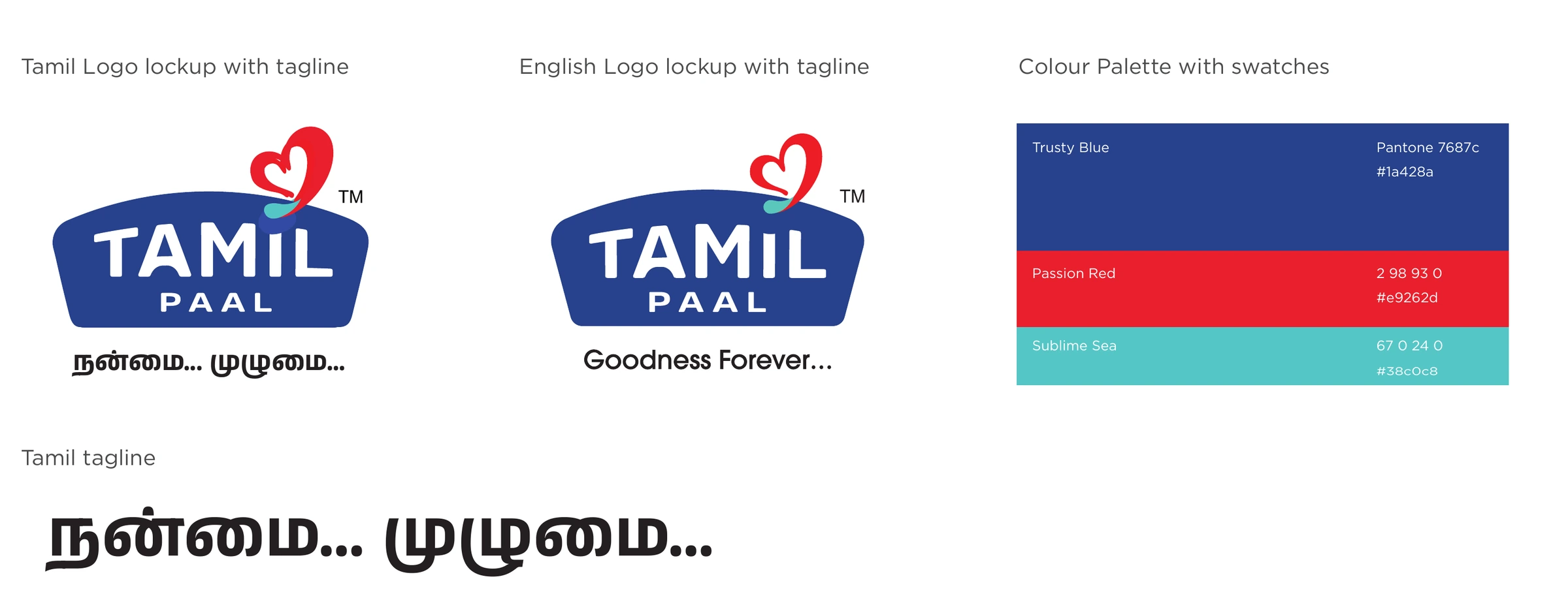
A heart carrying warmth
Delta-grown illustration
Colour-coded navigation
One identity.
Every touchpoint.
The same Annamalai, Delta warmth and Tamil pride extended across milk, curd, ghee, butter, paneer, sweets and every retail expression.
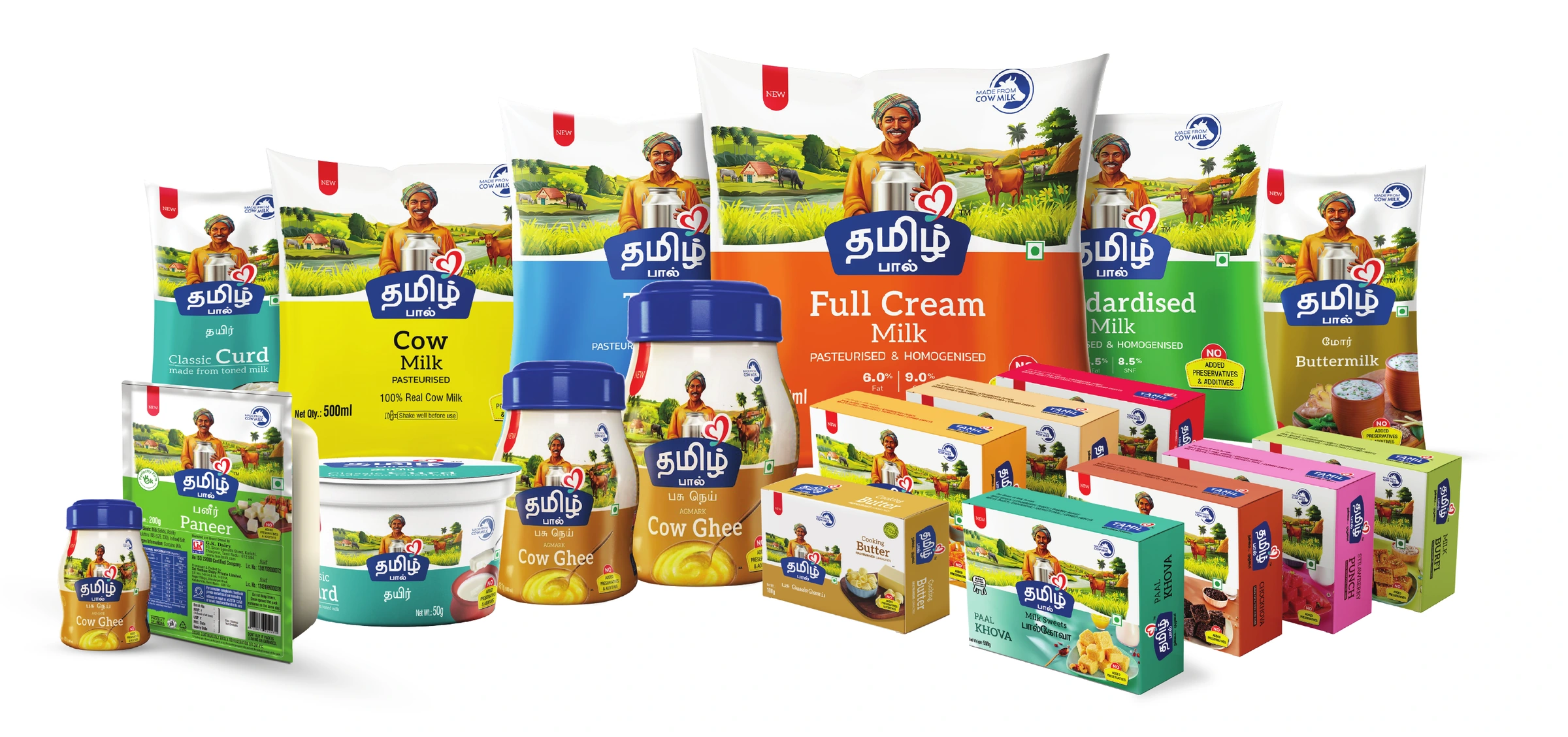
Packaging became the brand’s most important media channel — working every day at the shelf, inside the refrigerator and across the retailer network.
A brand that looks and feels consistent everywhere builds trust before advertising even begins.
Earlier, we sold Tamil Paal. Now Tamil Paal sells on its own.
The reforge did not make the brand less local. It made local value more visible, desirable and easier to choose.
CAGR in value-added product growth
Increase in retail shelf visibility
Packaging recall and differentiation
Customer repeat purchase rate
Retailer confidence score
Employee pride score
Next conversationBrands, Reforged.
Is your business stronger than the way your brand is understood?
Bring us the business problem. We’ll find the brand friction and rebuild what the market needs to understand, believe and choose.
Reforgeyour brand ↗